Your Website, Your Control
 Using the latest web technologies, we create modern, mobile-friendly websites that will help you get the best out of your online presence and engage your users, putting your information at their fingertips.
All our sites are built in WordPress to put you in control of your content, with built-in Search Engine Optimisation to make it as easy as possible for search engines to read & categorise your site. All you need is a web-browser and you can edit virtually anything on your website with an easy WYSIWYG editor.
Mobile First
 With mobile devices now outnumbering standard PCs, the web is on the move. Our sites are built using Responsive CSS, adapting to the size of the user’s device, looking great on both large & small screens.
From an iPhone to an iPad, MacBook to iMac, text & images remain crisp and user interface elements remain easy to access via mouse or touch.
Completed Sites
See below a few of our recently completed sites. We’ve been busy!
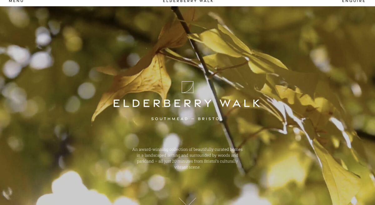
Elderberry Walk
Malcolm from MWA brought us in to develop a brochure website for Elderberry Walk, a property development situated near Bristol.
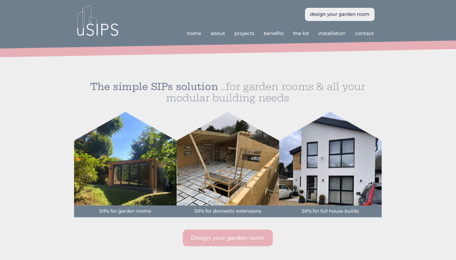
USIPs
USIPs required a new website to promote their range of structural-insulated panels, including a login-protected embed of their 3D building-designing web application. Lila Hunnisett designed the layout, adapted & updated by us and built using the WordPress Block Editor
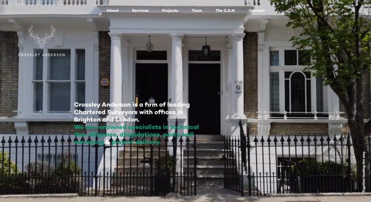
Crossley Anderson
More Creative Design brought us a design to revamp Crossley Anderson’s website. With fullscreen videos and bright and spacious visuals to show the key benefits of their most recent projects.
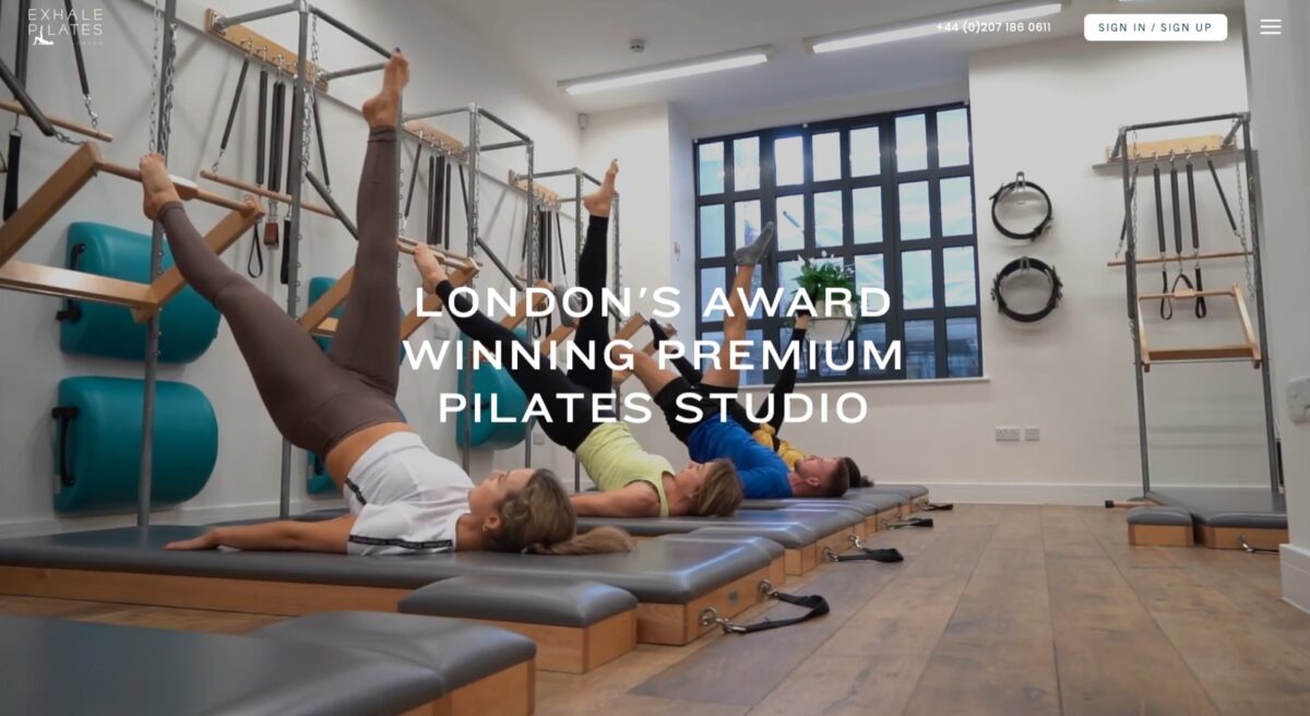
Exhale Pilates London
Exhale Pilates London’s brought us a design from Reggie to revamp their website, we built using the requested Advanced Custom Fields plugin so the client could concentrate on content with the front-end layout handling all the visuals
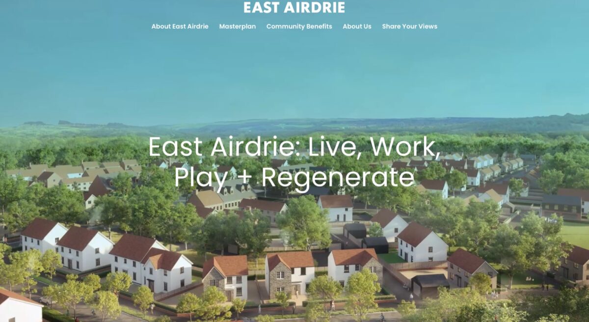
East Airdrie
Draught Design required a number of websites to publicise proposed housing developments, facilitating feedback from local residents and conveying the developers’ plans for each area. The site was built using the new WordPress Block Editor, to give the client ultimate control over both content and layout while editing.
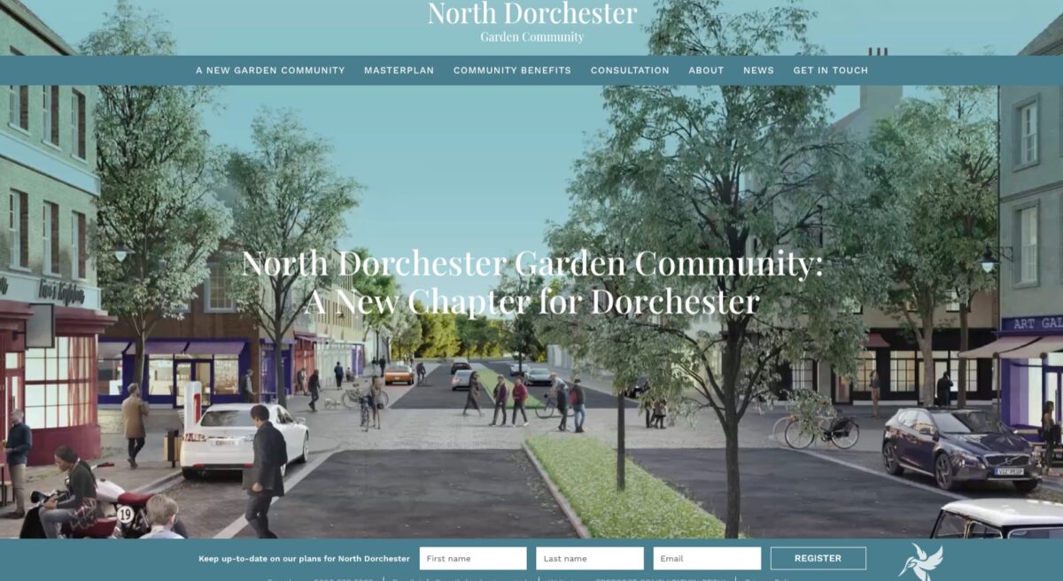
North Dorchester Garden Community
Draught Design required a number of websites to publicise proposed housing developments, facilitating feedback from local residents and conveying the developers’ plans for each area. The site was built using the new WordPress Block Editor, to give the client ultimate control over both content and layout while editing.
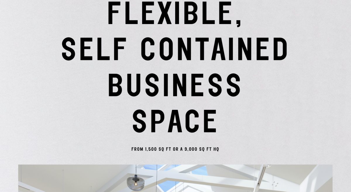
Radnor Studios
Working with designer MWA (mwa.london), whose client had requested a single-page scrolling website, we build a multi-sectioned scrolling page. With slideshows, floor-plans and bold typography, the site was built with the back-end editing as simple as possible, while allowing for multiple different content types.
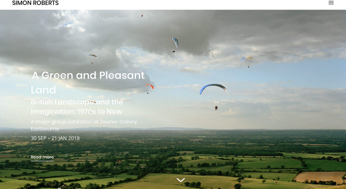
Simon C Roberts
Photographer Simon C Roberts approached me initially to update the code and functionality on his current website. It soon became apparent that (at 6 years old) the code was beyond repair.
We built a bespoke, responsive WordPress theme from scratch, basing the new design on the original site but with several modern tweaks. An auto-scrolling homepage with fullscreen images showcases Simon’s latest news, fullscreen slideshows effectively demonstrate Simon’s latest projects, while ajax-based content loading keeps the site loading quickly and effectively.
We also migrated a number of Simon’s websites to a more modern, php7-based web host, increasing the sites’ loading speeds noticeably.
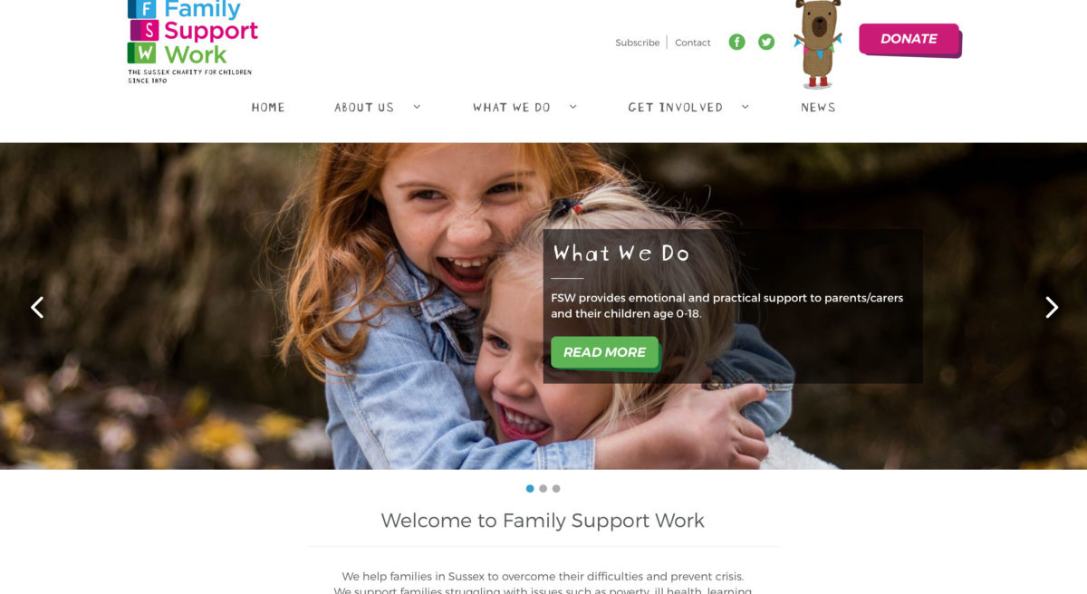
Family Support Work
Ape Creative had been working with a Brighton-based family support charity, Family Support Work, to redesign their website. The old site was beginning to show its age, so the new layout implemented configurable slideshows, on-scroll animations applied to page elements when they are visible onscreen and a new, vibrant and engaging design.
We built a bespoke WordPress theme, migrating content from the old site and building a back-end editor which multiple, reusable, blocks of editable content.
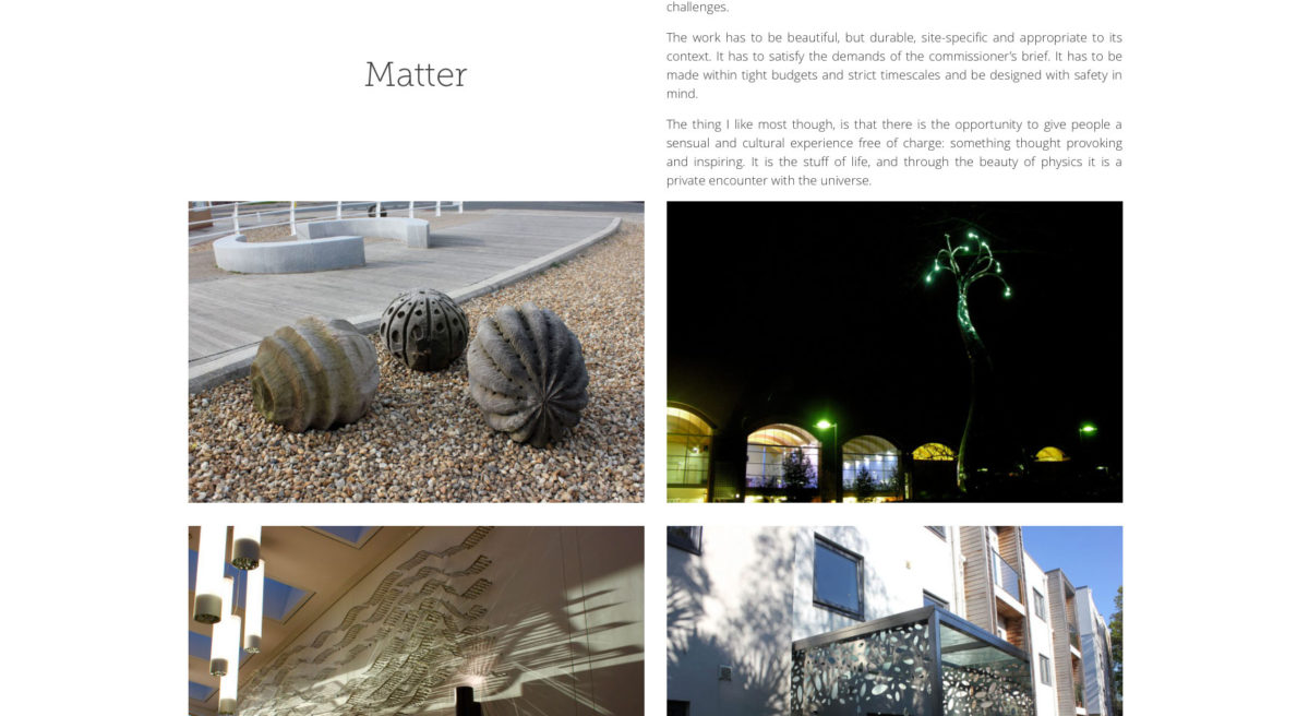
Steve Geliot
Steve approached us to rebuild his ageing WordPress website, which had become increasingly difficult to update. Based on his requirements, we designed and built a responsive WordPress theme, with a simple fly-out menu and subtle animations to bring a feeling of interactivity to the site. The homepage displays a fullscreen video shot by Steve, with content divided simply into Matter (sculpture) and Light (film).

Sophie Robinson
Another returning client, Sophie brought us an updated layout for the latest revision of her blog. Designed by Caz from Making Waves Creative, we built a responsive, dynamically loading theme, with support for users to comment on posts and sign up to Sophie’s mailing list, increasing engagement with her users.
We built an array of sidebar widgets to showcase posts and videos from around the site, and to bring attention to the interior design workshops Sophie runs.
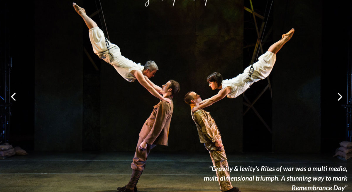
Gravity & Levity
Gravity & Levity, an Aerial Dance company, wanted to refresh their website with a modern and clean look. Their previous site (also built by us) was several years old so was lacking modern features like mobile responsiveness and dynamic content loading. G&L wanted a facility for their peers to upload new Aerial Dance events to be listed on the site, and for users to be able to sign up to their MailChimp mailing list.
We designed a new layout, with fullscreen slideshows, embedded YouTube/Vimeo videos and dynamically loaded page content. The new fold-in menu replaced a navigation system which had over time become convoluted and contradictory. G&L are now in full control of all their content and the site is much easier to navigate.
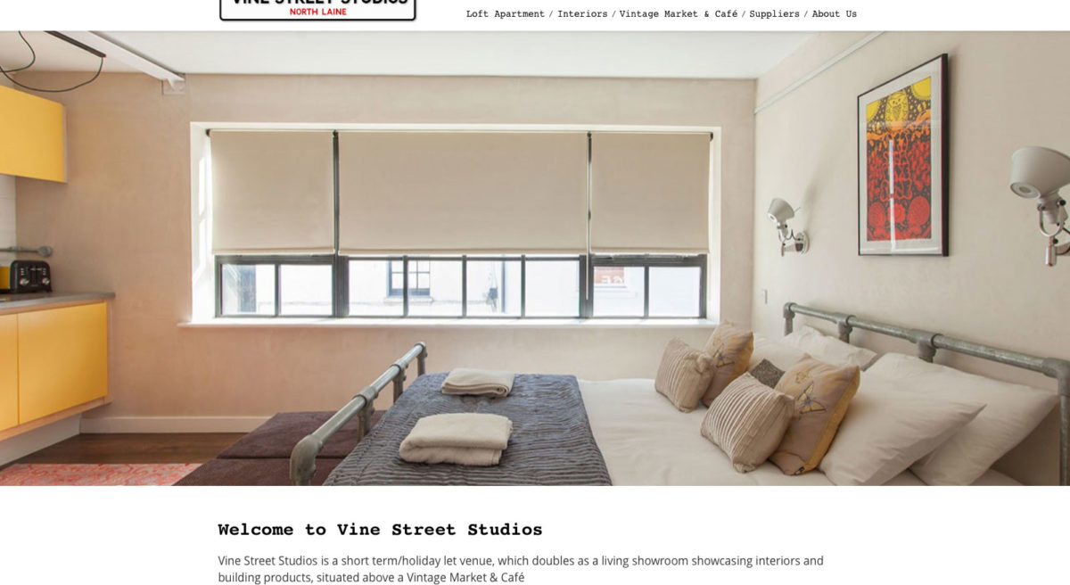
Vine Street Studios
The client requested their current WordPress theme be updated & modernised, with a more visual layout and better behaviour on mobile devices. We built a modern theme from scratch, using their current logo & layout as a foundation, including a full-width, responsive slideshow on the homepage to showcase their interior design shots. Back-end editing was also improved, with some outdated and convoluted functions replaced with easy to use content editors and galleries.
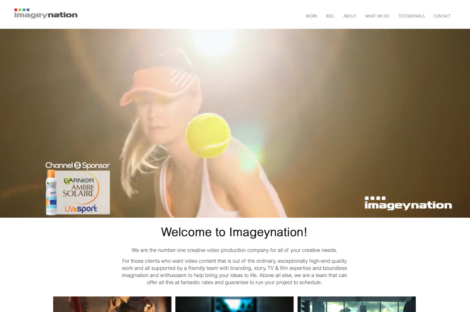
Imageynation
Neil from Imageynation brought us a layout to bring ultra-realistic CGI imagery to the web. Why pay for a photo/video shoot when you can create exactly what you want? We built the initial site, with a redesign a year later, adding an interactive CGI quiz to test the user’s eye for detail.
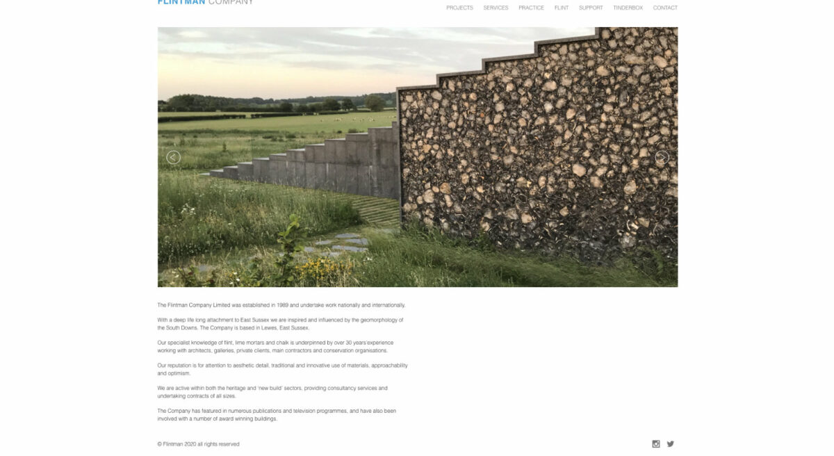
the flintman company
David Smith from the flintman company wanted a visually engaging site to act as both an information resource on flint & stone construction, but also to showcase the beautiful flint creations his company has built. Fullscreen slideshows scale from large to small devices, with all content and galleries editable by David, all thanks to WordPress

Keeki
Ali from Keeki wanted a simple, clean and cost-effective site to showcase her illustration and craft blog. We built the site using WordPress and the jQuery Masonry layout to provide beautifully laid out image galleries, with a minimum of administration required by Ali.
